seeing color differently

Saul Leiter: Paris 1959
Nate and Sarah just visited France and brought me back a book, Saul Leiter from the Louvre. Although I hadn't heard of Leiter before, I was immediately impressed with his subtle, dream-like street photos. I'm especially drawn to his color work. He apparently used expired film, which, combined with the immaturity of color film technology during the 40's and 50's, would've produced the kind of washed out, low-contrast images shown in the book. Seeing such color detail and attention to fine color gradations has opened my eyes toward a different way of shooting.
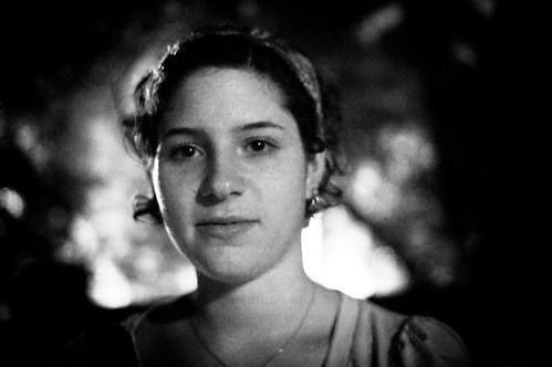
For a while, I have felt more attracted to high-contrast, rich images, and when "developing" my photos, I would consider how much contrast I could add before losing too much information. I enjoy throwing away much of the data that the camera dutifully recorded while retaining enough detail to convey the image I intended. That philosophy has lead me to come up with portraits like this one:
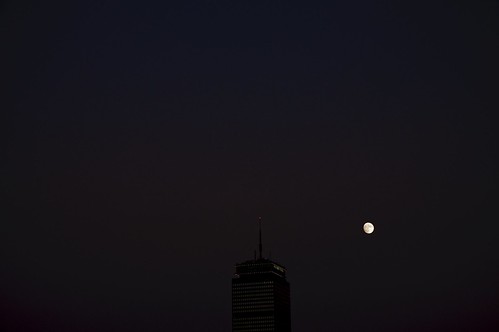
Or (less successfully) cityscapes like this:
After looking at Leiter's work, I'm going to try to think about color more intentionally and attempt a nuanced look. There can be just as much beauty in subtlety and flatness as there is in saturation and deep blacks. Here's a recent portrait:
And an old landscape near work. The coming autumn and winter light lends itself to this kind of lovely sky:
As much as I might try, however, it will be difficult to rival Leiter's wonderfully soft colors combined with abundantly detailed composition.


