Why is it black and white?
People sometimes ask me how I decide to convert a photo to black and white, and I don't have a simple explanation. I'll try to illustrate the thought process on a typical image.
There are some simple reasons for converting to monochrome:
- The scene is already desaturated or otherwise monochromatic.
- Color in the scene detracts from the content or message. (i.e. a bright red truck in the background)
- You're going for an old-fashioned look.
- You want the image to seem "serious," as in a journalistic style.
Sometimes the reasoning isn't as simple, and an otherwise perfectly fine color photograph might work better as black and white. Let's look an image straight from the camera (or as close as Aperture will lead me to believe):
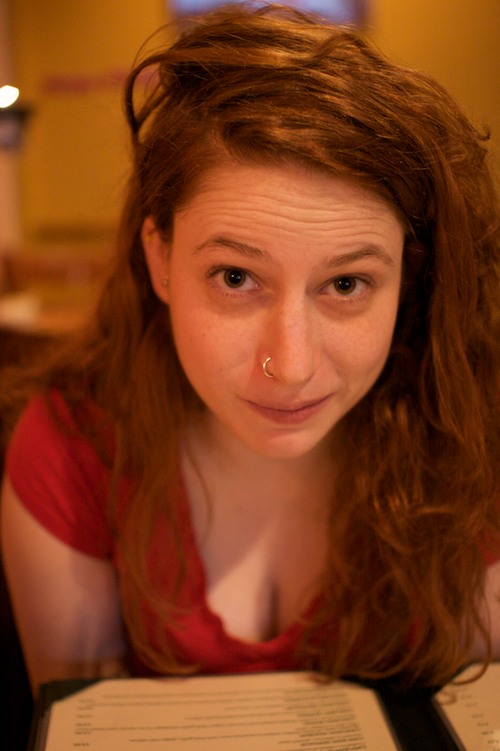
A candle-lit portrait with auto white balance usually spells ORANGE, so let's try to correct the white balance:
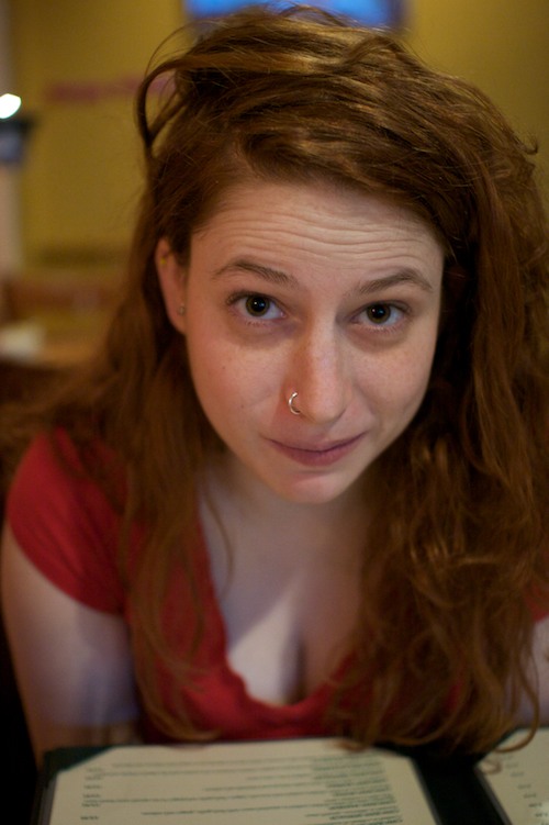
Now the image is merely murky and flat. I prefer more contrast, and my general rule is to increase contrast until I've lost too much information in the image, then bring it down a bit. So, completely black shadows are usually fine (the eye can make up the difference), but completely white highlights are to be avoided because the eye fixates on the brightest part of the image, detracting from the rest of the tones. Although I try not to go overboard with saturation, a little bit helps to bring out the natural color in faces. And I brought the exposure up about 2/3 of a stop to make the skin tone closer to reality.
This image is a little too red in the right cheek, but we'll let it slide for now...
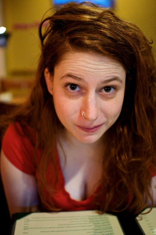
The question is, should I keep the image as color or convert it to black and white? In this case, even though the reds are vibrant, I don't think color adds enough to the image to keep it around. The blue window and yellow walls (with red stripe) in the background are a little distracting. The tricky lighting situation makes her face unnecessarily ruddy. On a nitpicky level, I took the photo at ISO 1600, which leaves some chroma noise that can be irritating at large magnifications (or even in print). Let's convert the image to black and white using Aperture's monochrome mixer at 90% green and 10% red. 100% green channel is too unnatural, but I like the look of this 90/10 mixture:
You can play around with different channels to get a more even-toned monochrome image. Since I like relatively high contrast and try to approximate the look of my favorite film images (this one is an extreme example), I go with the green channel and bring the black point up a bit. I may even increase contrast further.
Finally, the light in the top left ruins the illusion that this could be a film image (because the highlights are blown linearly, as only digital can produce). Let's crop it out:
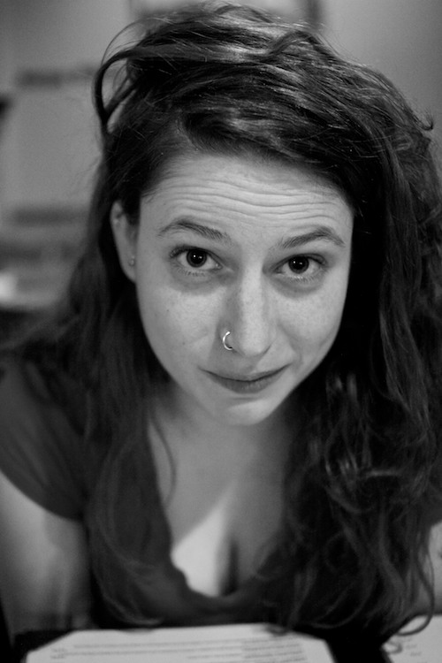
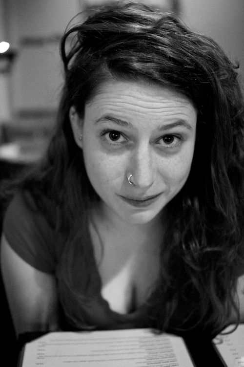
And there you have it. The photo isn't perfect, but we end up with a rich monochrome image with a reasonable amount of tonal gradation and texture, and no important information lost. If you look closely, the pupil and iris are still distinguishable, which is also something to take into consideration when fiddling with the contrast.
There are a lot of little details to think about when processing digital images, and the decision to convert an image to monochrome shouldn't be made flippantly. Sometimes a dull color photo can be made more interesting by converting to black and white (just as a dull image can be jazzed up by blasting the saturation or going crazy with Photoshop filters), but the challenge is to apply adjustments thoughtfully, understanding how the end result might affect your viewers' perception of what you're trying to show.
Whatever you do, don't click "convert to grayscale"!